Image
Image With Different Fill Modes
Five fill types are available: fill, contain, cover, none, and scale-down.
Image With Different Fill Positions
When the image is too large, provide different positions to display the partial left or right alignment of the picture.
Image Of Different Shapes
Available in three shapes: square, round corner and round corner. You cannot use circle to show a perfect circle when the image is not equal in length and width.
Component Status
Image Props
| name | type | default | description | required |
|---|---|---|---|---|
| className | String | - | className of component | N |
| style | Object | - | CSS(Cascading Style Sheets),Typescript:React.CSSProperties |
N |
| alt | String | - | - | N |
| error | TNode | - | Typescript:string | TNode。see more ts definition |
N |
| fallback | String | - | display fallback image on src loading failed. you can also use error to define more complex error content |
N |
| fit | String | fill | options: contain/cover/fill/none/scale-down | N |
| lazy | Boolean | false | - | N |
| loading | TNode | - | Typescript:string | TNode。see more ts definition |
N |
| position | String | center | - | N |
| referrerpolicy | String | - | attribute of <img>, MDN Definition。options: no-referrer/no-referrer-when-downgrade/origin/origin-when-cross-origin/same-origin/strict-origin/strict-origin-when-cross-origin/unsafe-url |
N |
| shape | String | square | options: circle/round/square | N |
| src | String | - | - | N |
| srcset | Object | - | for .avif and .webp image url, load srcset before src。Typescript:ImageSrcset interface ImageSrcset { 'image/avif': string; 'image/webp': string; }。see more ts definition |
N |
| onError | Function | Typescript:(context: { e: ImageEvent }) => voidtrigger on image load failed |
N | |
| onLoad | Function | Typescript:(context: { e: ImageEvent }) => voidtrigger on image loaded |
N |
何时使用
当需要对图像内容进行陈列、展示,以便用户快速了解图像信息时使用。
组件搭配使用
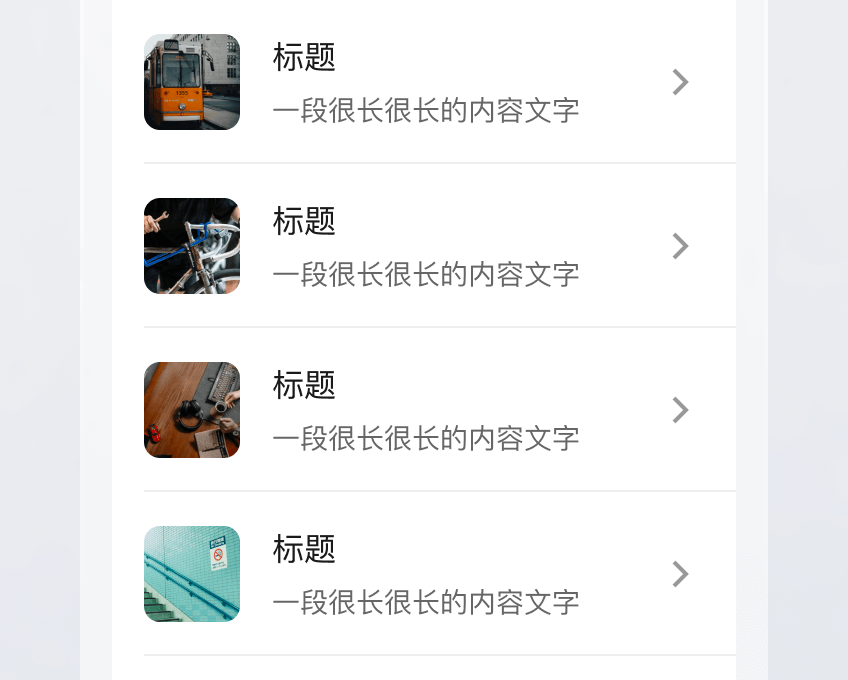
可使用宫格、单元格承载图片,作为某种功能、某类信息的入口。

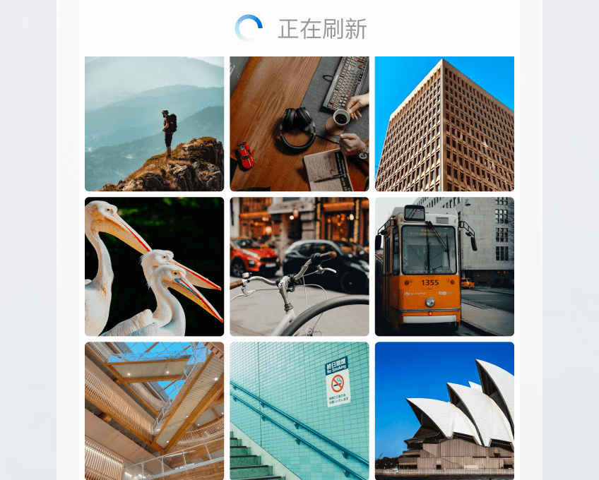
图片与下拉刷新组合使用,用于图片瀑布流时的内容更新。
推荐/慎用示例
当图片仅为展示,不具备预览功能时,应避免图片尺寸过小,从而影响图像信息的浏览和获取。


相似组件
| 组件名 | 何时使用 |
|---|---|
| 图片预览 | 当需要对展示的图片进行快速查看,以及在查看时存在放大、缩小、删除等操作诉求时使用。 |
Vue 2
Vue 3
React
Flutter
Design
MiniProgram
WeCom Group
Welcome to contact us


